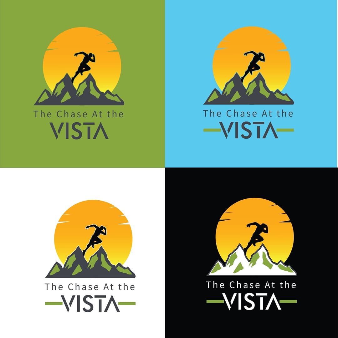
We began by exploring the key brand attributes: motion, nature, and achievement. The design team envisioned a logo that could reflect both the thrill of the chase and the serenity of the mountains.
The concept combines a runner silhouette—symbolizing energy and progress—with mountain peaks and a radiant sunset, representing endurance and triumph in nature’s landscape. The name “The Chase At the Vista” is stylized with modern typography, giving the logo a professional and contemporary look that appeals to both athletes and outdoor enthusiasts.
Design Highlights
-
Symbolism: The runner atop the mountains conveys strength, ambition, and perseverance.
-
Color Palette: Warm sunset tones contrasted with cool natural greens and blues to evoke excitement and outdoor freshness.
-
Typography: Clean and geometric fonts complement the bold visual mark, ensuring readability and balance.
-
Versatility: Designed to adapt seamlessly across light, dark, and colored backgrounds—ideal for marketing materials, apparel, and digital media.
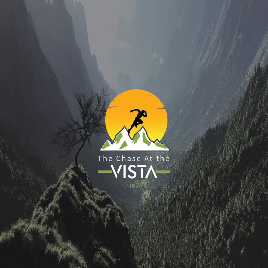
Visual Result
The final logo embodies the adventurous essence of The Chase At the Vista—a perfect fusion of nature, energy, and motivation. It gives the brand a distinctive identity that stands out in event promotions and creates a lasting impression among participants and spectators alike.